Introduction
Colour psychology is the study of how different hues influence human perception and emotion. In interior design, understanding this concept is crucial in creating spaces that are both functional and visually appealing. Colours influence emotions, behaviour, and even productivity. Whether you’re designing your home interiors or revamping office interiors, choosing the right colour palette is crucial. The right choice of colours can transform an environment, enhance mood, and even improve productivity.
How Colours Affect Human Emotions and Behaviour
Colours have profound effects on emotions and behaviours. For example, studies show that blue has a calming effect, making it ideal for bedrooms and offices, while red increases energy levels, making it suitable for social spaces like dining rooms. The way colours interact with the brain can impact decision-making, relaxation, and overall well-being.
The Importance of Colour Psychology in Interior Design
Colour isn’t just about aesthetics, it plays an important role in interior spaces ie, it has a profound psychological impact on our mood and perception. Understanding the emotional and psychological effects of different colours can help you create an environment that reflects your personality and enhances your well-being.
Why Colours Matter in Interior Designs.
1.Sets the Mood
Colours can make a space feel warm, cool, cozy, or vibrant.
2.Influences Emotions
Different colours trigger different feelings, from relaxation to excitement.
3.Affects Productivity –
Some colours can boost focus and creativity, making them perfect for workspaces.
4.Enhances Space Perception
Lighter colours can make a room look bigger, while darker shades add intimacy.
The Psychology Behind Colours.
1.Warm Colour and Their Effects
a. Red: Passion, Energy, and Warmth Red stimulates emotions and energy levels. It’s an ideal choice for dining rooms and social spaces but can be overwhelming if overused.
b. Orange: Warmth, Creativity, and Enthusiasm Orange is inviting and promotes social interaction, making it great for living rooms and entertainment areas.
c. Yellow: Happiness, Positivity, and Brightness Yellow evokes cheerfulness and is great for kitchens and workspaces, but too much can cause anxiety.
2.Cool Colour and Their Effects
a. Blue: Calm, Focus, and Serenity Blue reduces stress and is perfect for bedrooms and offices where relaxation or concentration is needed.
b. Green: Balance, Growth, and Refreshment Green is associated with nature and well-being, making it a great choice for bedrooms and living rooms.
c. Purple: Luxury, Creativity, and Sophistication Lighter purples like lavender promote relaxation, while darker purples add drama and luxury.
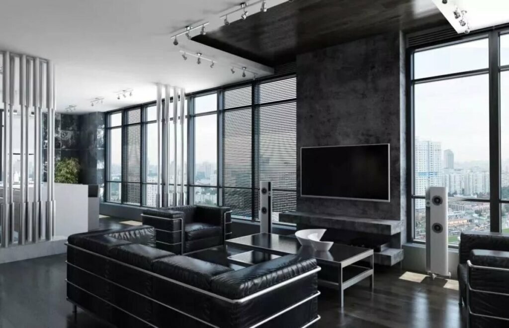
3.Neutral Colour and Their Role
a. White: Clean, Minimal, and Spacious White makes spaces look bigger and brighter, but too much can feel sterile.
b. Gray: Elegance, Balance, and Versatility Gray is a timeless neutral that pairs well with bold colours and adds sophistication.
c. Brown: Earthy, Cozy, and Comforting Brown creates a grounded and inviting atmosphere, great for rustic and cozy spaces.
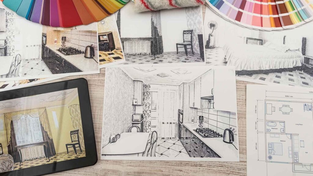
How to Choose the Perfect Colour Palette for Your Interior Space
1.Consider the Function of the Room
a. Living Room –Warm colours (yellow, orange) for a welcoming space.
b. Bedroom – Cool colours (blue, green) for a relaxing atmosphere.
c. Kitchen – Bright colours (yellow, white) to create energy and warmth.
d, Office – Blue or green for productivity and focus.
2. Assess Natural Light
a. Rooms with ample sunlight – Can handle darker colours without feeling small.
B. Low-light rooms – Work best with lighter shades to brighten the space.
3. Use the 60-30-10 Rule
A well-balanced colour scheme follows this rule:
60% Dominant Colour (walls, large furniture)
30% Secondary Colour (upholstery, curtains)
10% Accent Colour (decor items, pillows)
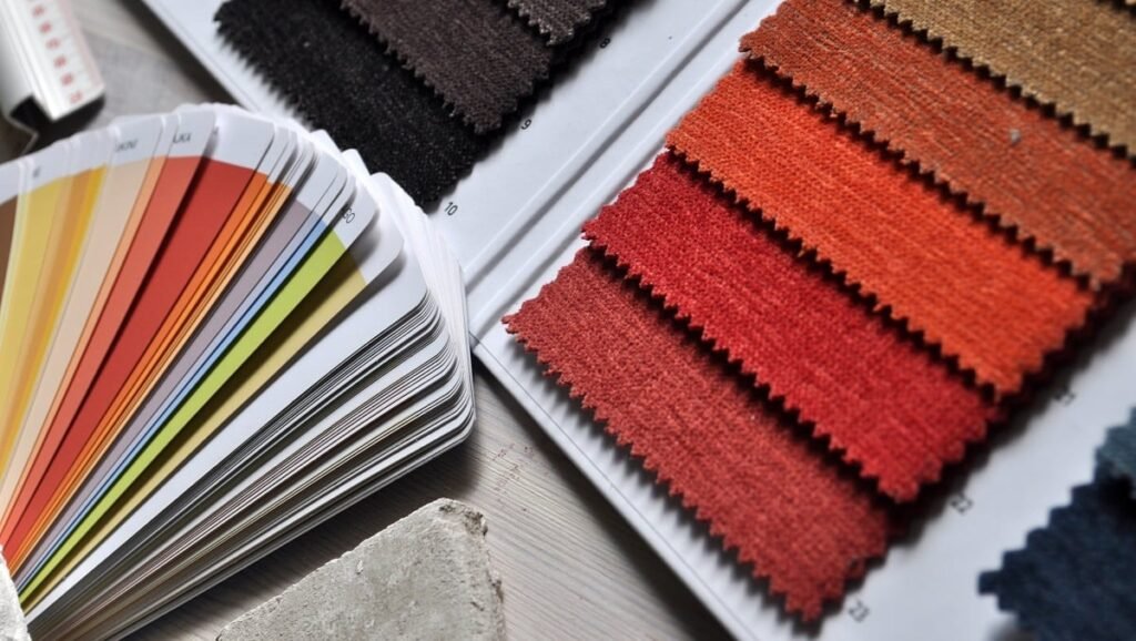
4. Experiment with Swatches and Samples
Test different shades before committing to ensure they look good in different lighting conditions.
The Impact of Colour Psychology on Interior Spaces
1.The Power of Blue in Workspaces Studies show that offices painted in shades of blue boost concentration and efficiency.
2.The Warmth of Yellow in Cafes often use yellow because it stimulates appetite and encourages social interaction.
3.Green in Healthcare Facilities Hospitals incorporate green to promote a sense of calm and recovery.
Common Mistakes in Choosing Interior Colours
1.Overuse of Bold Colours:
While bright colours can be energizing, too many bold tones can overwhelm the space.
2.Clashing Tones:
Choosing colours without considering harmony can result in an unbalanced aesthetic.
3.Ignoring Natural Light:
Lighting significantly affects how colours appear; always test samples in different lighting conditions.
Conclusion
Choosing the right colours for your interiors is more than just picking your favorites. Colour psychology plays a crucial role in creating the right ambiance, influencing emotions, and improving overall well-being. By understanding how colours affect mood and behaviour, you can craft spaces that are not just beautiful but also functional and harmonious.
FAQs
1.What is the best colour for a small room?
Light colours like white, beige, or pastel shades make a small room appear larger and more open.
2. Can colours affect my mood?
Yes! Warm colours can energize you, while cool colours can promote relaxation and calmness.
3. Which colours are best for a productive workspace?
Blue and green are great for focus and productivity, while a pop of yellow can inspire creativity.
4. How do I balance multiple colours in a room?
Use the 60-30-10 rule to create harmony, with 60% dominant colour, 30% secondary, and 10% as an accent.
5. Is it okay to mix warm and cool colours?
Absolutely! A balance of warm and cool colours can create contrast and visual interest in a space.
Visit: https://paiwalainteriors.com/
Email: info@paiwalainteriors.com
Call us: +91-93263 20580